Boosting the Zendesk trial
Hypothesis
Our customer support tickets and Success manager feedback indicated that the Zendesk 14-day trial was challenging to navigate and therefore wasn’t converting trialers to subscribers.
Our hypothesis was that there were two major points of friction: unclear IA labels that made it hard for trailers to navigate setup tasks and inconsistent UI patterns and language due to many teams working on the trial over the years. We also saw a missed opportunity to drive trialers to subscribers before the 14-day period concluded.
My Role: UX Content Design Sr. Manager - strategy, IA, and UX writing QA

Approach
As the content designer manager, I worked with the PM to align on strategy for the new trial and advised the UX writing and IA work with the content designer on the workstream.
Our approach:
Map existing trial to identify low-value steps with the purpose of simplifying and shortening
Do quick UXR to validate trial language with users - to lower confusion around certain trial terms
Create a new trial centered on 5 task chapters with easy instruactions and a progress incentivization
Rewrite all content with coaching voice and tone
Provide key content onramps to subscription Shopping Cart page within trial experience

User research
Task completion is a clear driver of conversion. We need people to understand the tasks immediately and feel empowered to complete them.
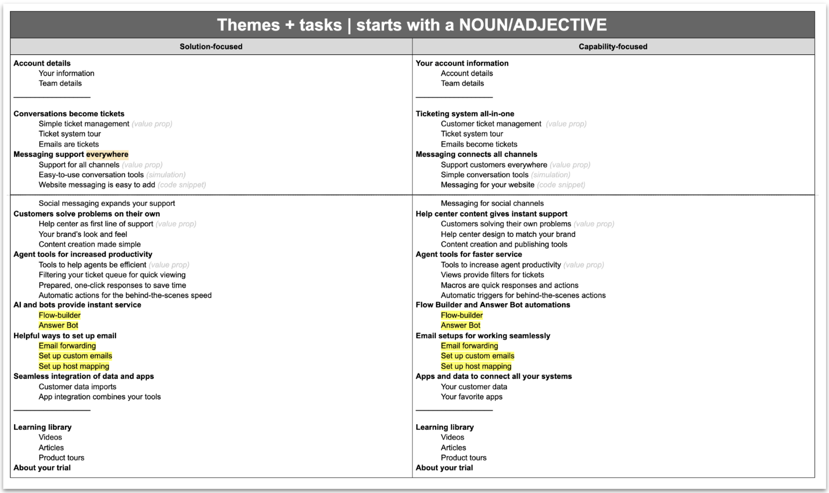
To validate task label comprehension, we tested differing task lexicon via usertesting.com.
This research was really the lynch pin for the new trial! It actually went against everything the team and PMM had proposed.
We thought that value-oriented language like “Website messaging is easy to add” would resonate but we were wrong. Capability oriented language like “Messaging for your website” is what users understand.

New components
The content strategy for this trial resulted in three new UI components and patterns that could scale to other onboarding experiences:
New task level IA
Feature walkthrough patterns
Value proposition modules

The new Zendesk trial is easier to understand! That makes it easier to use.
Content Design on this project involved:
Information mapping
UX writing
Content research
Taxonomy
IA
Naming

Outcome
The new Zendesk trial was a success:
13% increase in verified Shopping Cart rate visits from Trial
64% lift in Average Deal Size (EMEA), 34% lift in Average Desl Size (AMER)
2X increase in baseline conversion
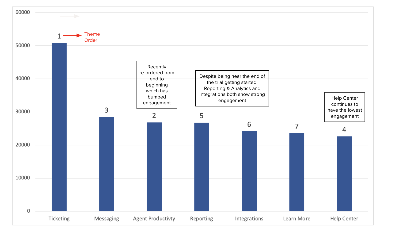
Sustained page view engagement throughout trial - this indicated content was resonating with trialers and that the previous problem of confusion-based dropoff was no longer an issue
Help Center tickets for trialers decreased